Hear the perspectives behind the issue.
Discussion that explores social questions, representation, and community.
 Request a conversation →︎
BETTER / MEDIA & COMMUNICATION
A brand built to invite new perspectives, spark constructive dialogue, and give people something to think about.
Explore the project ↓︎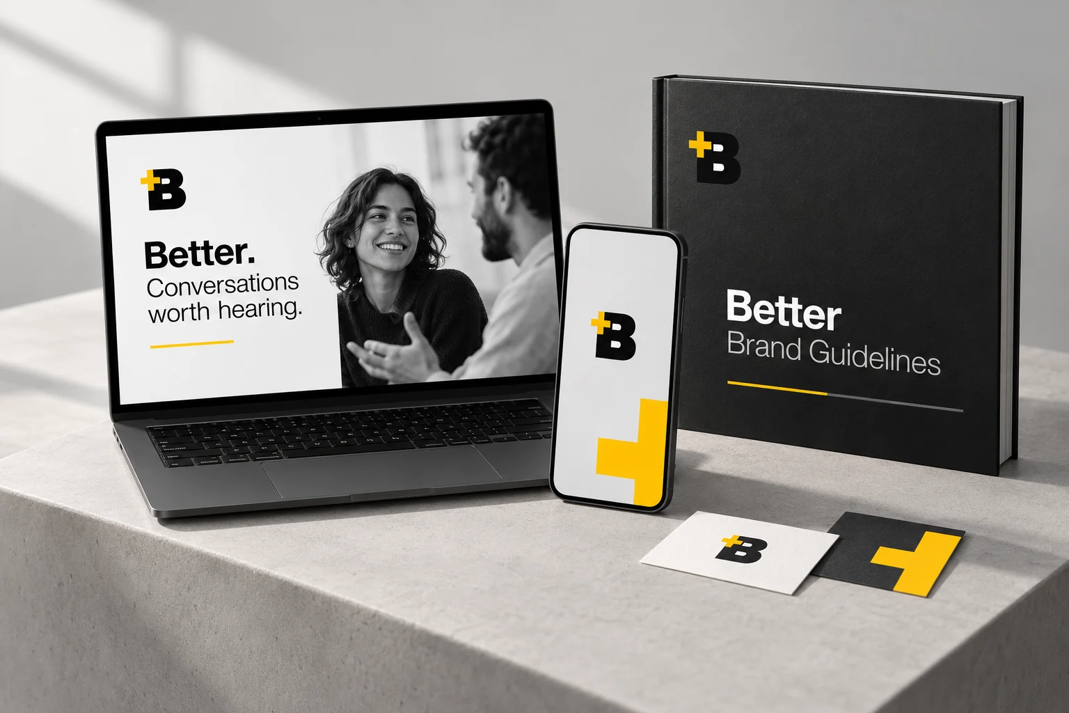
Brand strategy · Audience direction · Naming · Messaging · Identity · Website direction
THE CHALLENGE
Better needed a clear way to explain its media concept and distinguish it from other platforms sharing ideas.
The brand brief centered on a conversational model: multiple perspectives, thoughtful exchange, and a community that grows through communication.
We connected that direction to the brand’s message and visual identity, giving the team a reference for how Better should speak, look, and introduce itself.
WHO BETTER IS
The brand brief defined Better around an exchange of ideas: multiple voices, constructive dialogue, and an audience invited to think alongside the speakers.

The positioning work emphasized conversation and participation as Better’s distinguishing premise. It gave the company a clear way to describe the kind of experience it wanted to create.
The storytelling framework explored a learner who feels isolated, seeks a community, and finds a place to exchange perspectives. That illustrative narrative connects the offer to the need for understanding and belonging.
AUDIENCE STRATEGY
The brief and audience work explored what would bring people into Better’s world and what they would hope to take away.
Discussion that explores social questions, representation, and community.
Ideas about communication, self-awareness, and the choices that shape a person’s life.
Perspectives on artistic expression, culture, and creative practice.
Conversations about building a business, leadership, and growth.
These profiles show the audiences explored in the strategy work, rather than measured audience or attendance results.
BRAND DISCOVERY & STRATEGY
The work established a mission, a vision, and values to guide the company’s communication and experiences. The SWOT analysis also examined how Better could stand apart while maintaining discussion quality and a respectful environment.
A media company curating experiences that encourage constructive dialogue, empathy, and the exchange of different perspectives.
A shared direction for building a space where people can engage with new ideas and learn from one another.
These values gave the team a reference for choosing topics, shaping the tone, and deciding how Better should participate in a conversation.
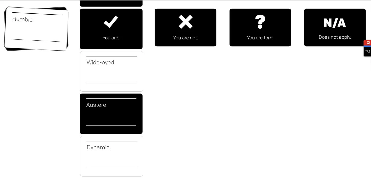
INSIDE THE PROCESS
The Brand Room exercise explored which traits fit Better and which did not. It gave the discussion a concrete starting point before the guidelines took shape.
VISUAL IDENTITY
The yellow plus in the Better mark represents growth in connection and knowledge. The bold B gives the identity a recognizable center.
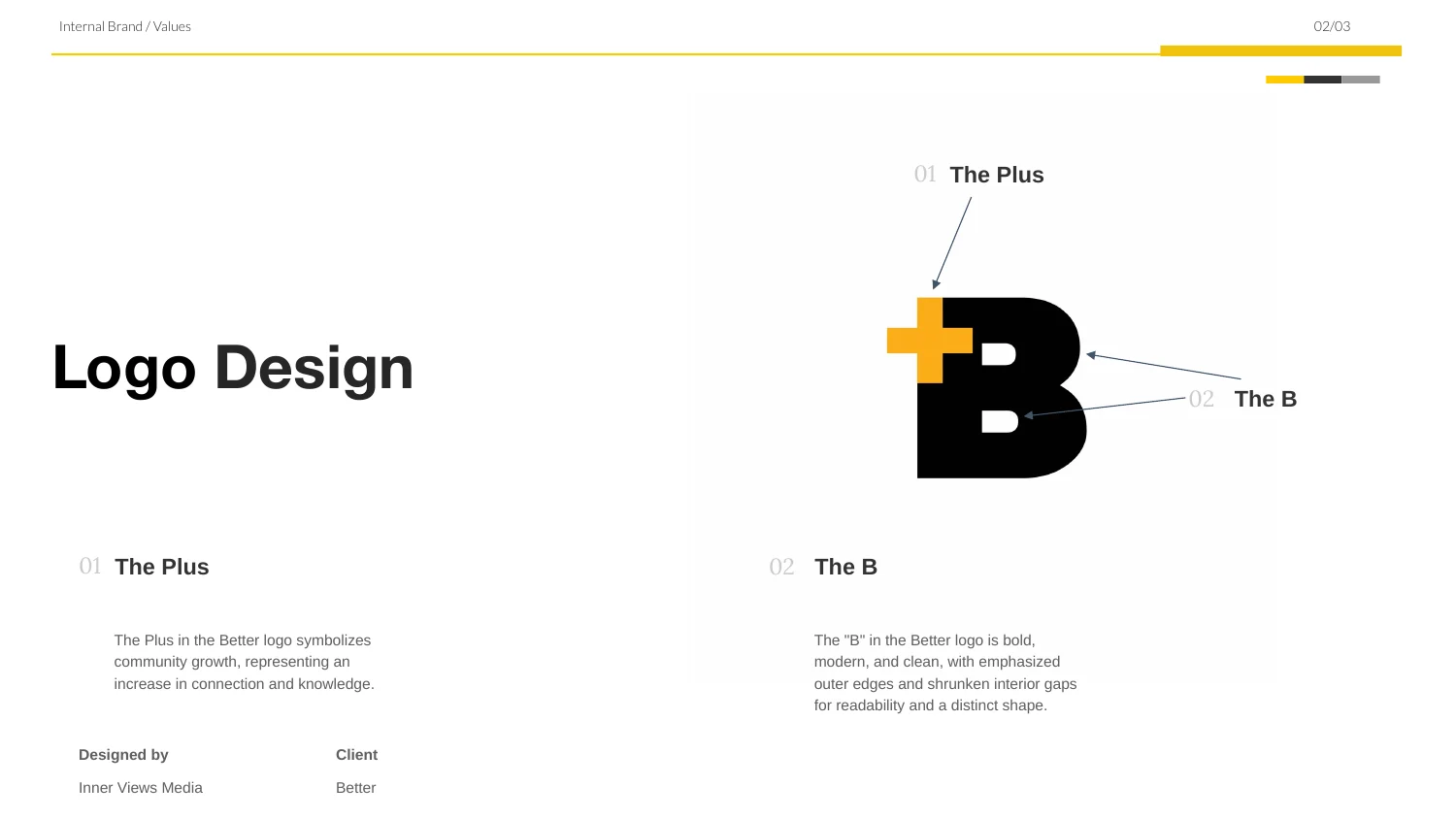
Logo guidance explains the relationship between the brand’s purpose and its visual form.

A neutral foundation and bright yellow accents give Better a bold, consistent visual language.
Excerpts from the working brand guidelines.
TONE OF VOICE & MESSAGING
The messaging and voice guidance connected the company’s ideas to the words people would hear and read.
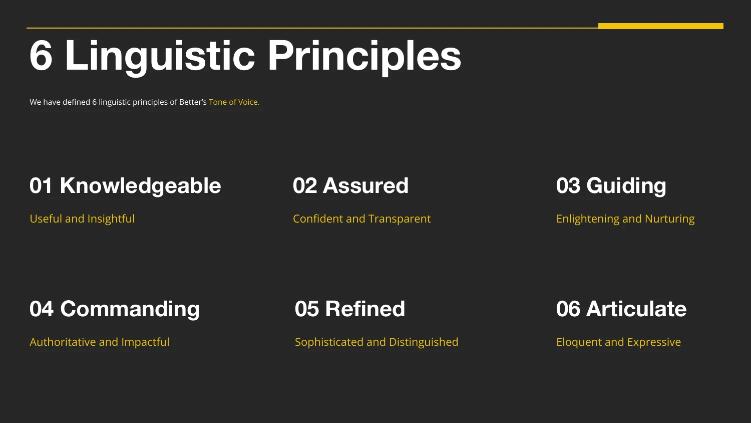
The voice framework defined six principles, supported by examples, to guide writing across the brand.
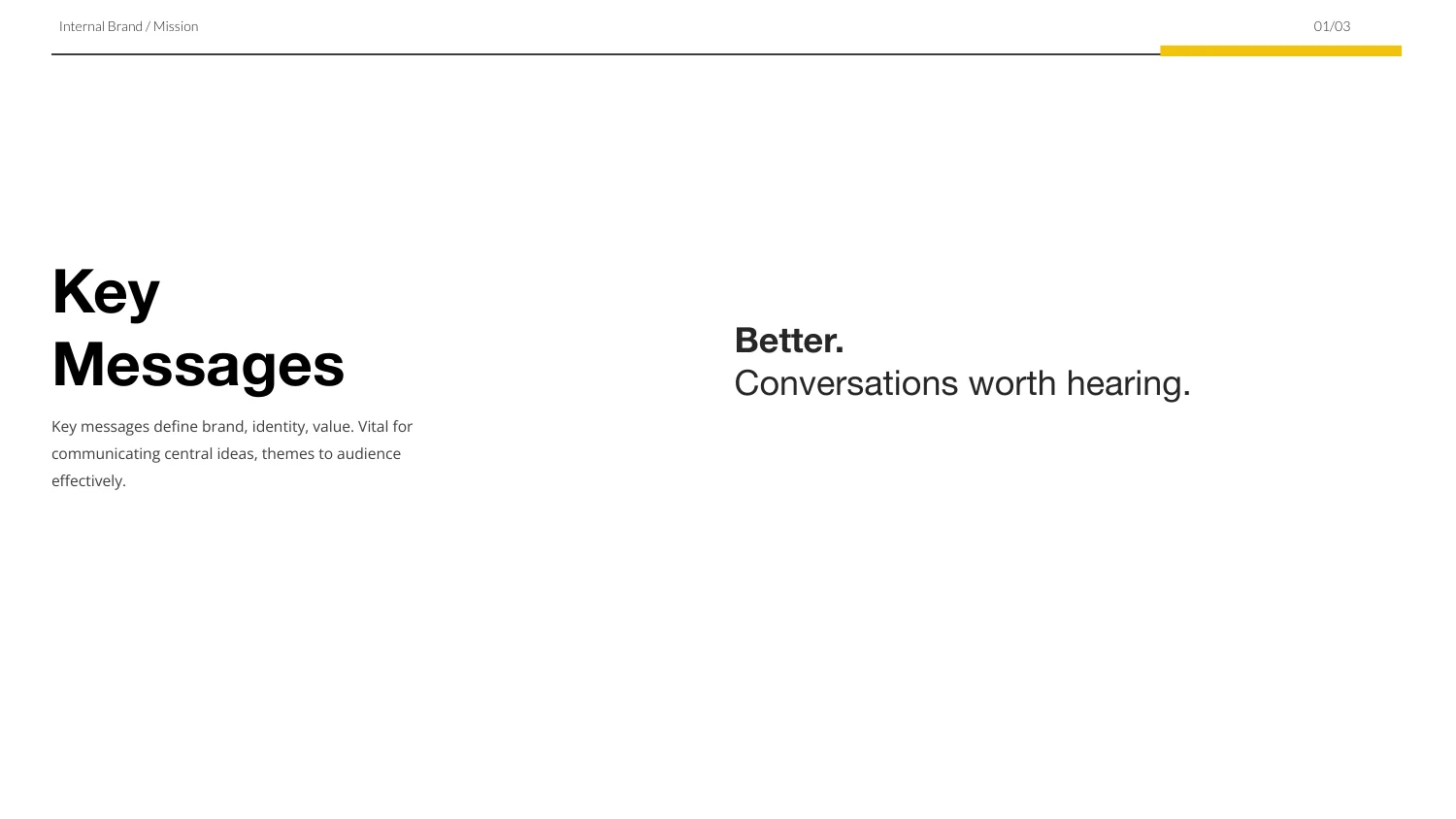
“Conversations worth hearing” makes the premise easy to understand. The wider messaging explored how questioning, creating, and evolving connect to becoming Better.
THE BRAND ON SCREEN
The supplied website walkthrough shows the visual direction taking shape in a web experience.
Website design in progress, recorded from the project files. Placeholder copy is visible; this preview shows the design at that stage of the work.
PUT THE IDENTITY TO WORK
The guidelines carried the identity into practical applications, including letterhead and other brand materials.
The imagery guidance also described how color, multimedia, and emotion could help Better stand out.
View the image direction excerpt ↗︎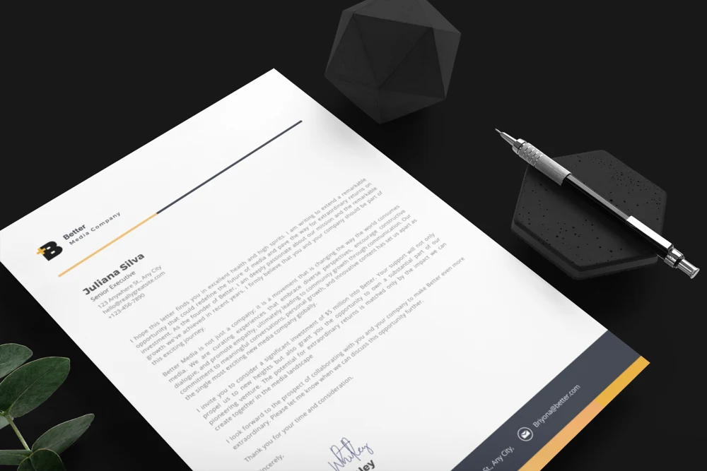
NAMING & BRAND ARCHITECTURE
The naming document explored a connected family of experiences, content, and community around the Better ethos.
Working naming concepts from the project documentation. They are presented as strategy examples, not a list of launched events or active products.
EXPERIENCE PLANNING
The event planning worksheet explored OpinSync, a participatory conversation concept, and organized the practical decisions needed to develop it.
The premise, topics, and audience participation that define the proposed event.
Roles for event management, venue coordination, content, promotion, and technical support.
Planning, promotion, preparation, event day, and post-event review.
Venue, labor, promotion, equipment, catering, logistics, and other expenses.
The worksheet is a planning framework, not confirmation that an event took place or achieved a particular result.
This reference reel illustrates the intended visual tone and treatment. It is presented as creative direction rather than a finished Better campaign.
WHAT THE WORK PROVIDED
A documented brand direction, audience profiles, messaging and storytelling frameworks, naming concepts, and a visual identity gave the team a shared reference for building Better.
Tell us about the brand you want to build →︎Next project: Still Community ↗︎Make the connection to your business
See what Brand Launch can include, or tell us what you want to change.